
How We Chose Paint Colors for Our 1898 Victorian Farmhouse
- Reorigination
- 3 days ago
- 10 min read
Why we stopped searching for historically accurate colors and started building a whole-house palette

If you've ever fallen down a paint color rabbit hole, first of all, welcome. Second, I'm sorry.
What starts as a simple search for "the perfect white" somehow turns into 47 browser tabs, 300 Pinterest screenshots, and a growing suspicion that every paint color changes completely depending on the time of day, the weather, and whether Mercury is in retrograde.
When we started restoring our 1898 Victorian farmhouse, Maggie, I assumed choosing paint colors would be one of the easier decisions. After all, paint can always be changed later, right?
Instead, it became one of the most important decisions we made.
Not because we were choosing colors for a single room.
Because we were choosing a color language for an entire house.
Over time, I realized that the goal wasn't finding the perfect paint color. It was creating a palette that felt believable for Maggie, worked with the home's existing character, and gave us confidence in the hundreds of design decisions that would follow.
And surprisingly, that process didn't start with paint at all.
It started with a fireplace.
The Colors We Associate with Victorian Homes Aren't the Whole Story
One of the first things I learned while researching Victorian interiors (with the help of a growing collection of old house books and restoration references) is that there really isn't one universally "correct" Victorian color framework.
The Victorian era spanned decades. Color trends evolved. Technology changed. Wallpaper styles changed. Paint availability changed.

A grand Victorian mansion in a city would likely have looked very different from a farmhouse in rural Tennessee.
In fact, many Victorian homes relied heavily on wallpaper to introduce color and pattern. Rich greens, burgundies, teals, browns, and reds became increasingly common as advances in pigments made more color options available to homeowners.
While none of these particular wallpapers made it into Maggie's next chapter, they were a great reminder that inspiration can come from anywhere. (If you're looking for Victorian and Victorian-inspired wallpapers, I've rounded up some favorites that capture the same sense of character and charm.)

Our goal was never to recreate a museum.
It was to create a home.
The more layers we peeled back, the more obvious that became. (Of course, discovering those layers required a fair amount of demo work first. If you're tackling an old house of your own, I've rounded up the tools and supplies we reached for most often during Maggie's demolition and discovery phase.)
Behind Maggie's walls were traces of multiple generations. Different wallpapers. Different paint colors. Different decorating styles. Every family that lived here left its own fingerprints behind.

Some color combinations felt timeless.
Others felt very much like a specific decade.
A few made me stop and think, "Well... that was certainly a choice."
And honestly, I love that.
Because it reminded me that houses evolve.
The people who lived here before us weren't preserving Maggie for a future audience. They were making decisions that felt right for their lives at that moment in time.
That realization completely changed how I approached her colors.
Instead of asking:
"What colors should this house have had in 1898?"
I started asking:
"What colors feel like they belong here?"
The Fireplace Tile in My Purse
Long before we chose paint colors, purchased furniture, or created mood boards, I was certain about one thing: I wasn't going to change the original fireplace tile (or the fireplaces in general)!
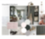
Of the four downstairs fireplaces, the parlor fireplace had the most intact and intricate tilework. The colors were definitely unlike anything I would have naturally chosen on my own. Vibrant greens. Pinks. Browns. Hints of teal.

So if you had told me years ago that I'd be carrying Victorian fireplace tile around in my purse while defending a pink and green color palette, I probably would've laughed.
And yet, there I was.
Some of the tiles had already come loose during restoration, which meant I could take them with me. They went to paint stores. They went antique shopping. They sat next to paint swatches under fluorescent lights at Lowe's. They came back to Maggie so I could see how those same colors behaved in natural light. (If you're in the middle of choosing paint colors, I've linked some of my favorite paint supplies, sampling tools, and color-testing resources.)

What I was looking for wasn't an exact match.
I wasn't trying to make every room pink and green.
I was trying to identify the color families that already felt at home in this house.
The more combinations I tested, the more obvious the direction became.
Greens in varying depths.
Soft pinks.
Warm whites.
Weathered grays.
Natural wood tones.

Just as importantly, I rejected plenty of colors along the way. If a color competed with the tile instead of complementing it, it was out. If it looked beautiful on a paint chip but felt disconnected from the house itself, say goodbye.
Eventually, I wasn't carrying around paint options anymore.
I was carrying around our Official Maggie Victorian Farmhouse palette.
How I Knew the Colors Belonged Together
So how did I make those decisions? Well, I found myself dusting off parts of my art degree that I hadn't used in years.
While I wasn't sitting around creating color wheels for fun, I was absolutely leaning on some basic color theory principles to help guide decisions.
The biggest one was undertones.
If you've ever picked out paint colors and thought, "These are all green. Why do they look terrible together?" undertones are often the reason.

Some greens lean yellow.
Some lean blue.
Some whites feel warm and creamy.
Others feel crisp and cool.
Even grays can lean warm, cool, brown, blue, or green.
As I compared paint samples against the fireplace tile, I wasn't necessarily looking for exact matches. I was looking for colors that shared a similar character and temperature.
Most of Maggie's palette leans muted, natural, and slightly softened by gray or green undertones.

That's why a soft blush pink like SW Gorgeous White can comfortably live in the same house as SW Rock Bottom, which is nearly black. On paper they sound completely unrelated. In practice, they feel like members of the same family.
If you're trying to build a palette of your own, here's the simplest advice I can offer:
Pay less attention to the color name and more attention to the undertone.
I wasn't trying to find the "perfect green."
I was trying to find the greens that belonged in this farmhouse color family.
Once I had identified those, you better believe we made room for the paint swatches to officially join the traveling fireplace tile party in my purse.

The Unexpected Benefit: Less Decision Fatigue
What I didn't anticipate was how much easier every other design decision would become.
You're not just choosing paint. You're choosing lighting, countertops, rugs, textiles, furniture, hardware, wallpaper, artwork, window treatments, landscaping, and about a thousand other things I haven't even thought about yet.

Individually, none of those decisions seem particularly difficult.
Collectively, they can feel exhausting.
That's why establishing the palette early was so valuable.
The same fireplace tile and paint samples that helped me choose wall colors also helped me choose rugs, bedding, antiques, wallpaper, and even quartzite countertops for the kitchen and primary bathroom.
While those materials were brand new, they still needed to feel at home beside original fireplace tile, natural wood tones, warm whites, greens, and all the other materials already telling Maggie's story.
The palette became a filter.
Instead of standing in front of every new decision wondering what direction to go, I already had a framework.
The result was less second-guessing, fewer impulse decisions, and far fewer moments of staring at 37 open browser tabs wondering how I ended up here.
I wasn't constantly reinventing the wheel.
I was simply continuing a conversation that had already begun.
The Moment It Started Working
For a long time, all of this existed mostly in theory.
There were the paint chips.
Mood boards.
Saved inspiration photos.
A purse full of increasingly questionable house parts...
But very few finished rooms. (Remember we've been at this for yearssss)
Then slowly, room by room, things started coming together.

The kitchen and primary bathroom were two of the first spaces where I could really see the color story at work. Both rooms share a similar foundation of creamy white walls and dark green cabinetry, yet they don't feel identical.

The primary bedroom then picked up those same colors in a different way. The walls remained light and airy while greens, pinks, and grays appeared through textiles, curtains, rugs, and furnishings.

Then there was the parlor.
The room that started this whole journey.
Instead of using green as an accent, we wrapped the room in it.
I remember wondering whether the room would feel too dark.
Thankfully, the fireplace tile had already done most of the hard work.
The greens connected back to the tile. The leather tones connected back to the tile. The pinks and creams found their way into other details throughout the room.
And that was probably the first moment I knew the Maggie palette was working. (If you love the layered Victorian farmhouse look of the parlor, I've rounded up some of my favorite books, decor, lighting, wallpaper, and design elements that helped inspire the space.)

Not because every room matched.
But because the rooms felt connected.
Every room had its own personality.
But they all belonged to the same family.
Today, we're preparing to paint our dining room the darkest almost black green in the entire house.
A few years ago, that decision probably would have made me nervous.
Now it doesn't.
Not because I know exactly how the room will look when it's finished.
But because I trust the color guide we created years ago.
I know these colors work together. I know they belong in this house.
The palette doesn't remove every design decision.
It just gives me confidence in making them.
So Where Should You Start?
If you're standing in an old house or room staring at 500 paint chips and wondering where to begin, my advice is surprisingly simple:
Don't start with paint.
Start with an inspiration piece.
For us, it was the fireplace tile.

For you, it might be an original wallpaper fragment hiding behind a wall. It might be a vintage rug you've loved for years. It might be a piece of artwork, a fabric, a stained glass window, or a favorite antique.
What matters is giving yourself a starting point.
Once you have that anchor, start looking for the colors hiding within it. Pay attention to undertones. Look for the common threads that connect them.
Then build a palette.
Whether for a room or even for the house!

What I find most interesting is that these foundational colors aren't really recreating any one moment in Maggie's history.
The wallpapers we uncovered told different stories. The paint layers told different stories. Every family that lived here added something of their own.
This palette is simply our chapter.
Inspired by the fireplace tile that was already here. Influenced by the colors that came before us. Adapted for the way we live today.
In a way, that feels a lot like Reorigination itself.
Not a perfect recreation of the past.
Not a complete departure from it.
Just another beginning.
Maggie's Color Palette (So Far)
Whites & Neutrals
Sherwin-Williams Extra White
Sherwin-Williams Alabaster
Sherwin-Williams Mindful Gray
The Green Family
Sherwin-Williams Rainwashed
Sherwin-Williams Rosemary
Sherwin-Williams Dried Thyme
Sherwin-Williams Rock Bottom
Accent Color
Sherwin-Williams Gorgeous White